Thursday, June 19, 2014

Market Dashboard - Bearish Signs


Overall, I'm a little concerned about the next few days / weeks for US equities.  The LDI is currently displayed in a binary (bullish or bearish) setup.  However, the behind the scenes math does have a degree of severity.  Today the raw numbers behind the LDI took a nasty turn lower.  Coupled with a bearish divergence on the Russell 2000, we may be seeing a bit of a correction before long.

Wednesday, June 18, 2014

Market Dashboard - News Rally

Today's the primary indicator #1 moved back up to the overbought range as a result of the Fed news inspired rally.  I'm not sure how long this will last because the LDI is still bearish.

Tuesday, June 17, 2014

Market Dashboard - LDI swings bearish


Today there were mild gains in the major US indexes and a pretty strong showing in the Russell 2000 small cap index (below.)  The LDI (leading directional indicator) swung back to the bearish side today leading me to think there is more correction just around the corner.  


Monday, June 16, 2014

Market Dashboard - Small Caps Up

Today's market was relatively unchanged, however we did see the Primary Indicator #2 continue to decline. Notably the Russell 2000 was positive on the day to the tune of .5%.  This is likely what we are seeing drive the LDI (Leading Directional Indicator) positive.  The Russell chart looks like it may have some legs to run on, so we may stave off a correction for a little longer.

Saturday, June 14, 2014

Market Dashboard - Retreating with a bounce

Primary indicator #1 has moved into the trending zone and primary indicator #2 is continuing to retreat in the trending zone.  Of note, the leading directional indicator did swing bullish.  This may indicate a quick market bounce, but it is too early to signal a good entry point.  If it had happened with Primary #1 and Primary #2 in the green, then I would put my money to work.  For now, it looks like a good time to keep money in a safe place with very little US equity market exposure.

Above is a screen capture from my thinkorswim platform.  I've been looking at a study that comes with the software called volume profile.  It is a measure of volume against price levels.  You can see how much it resembles a bell curve (I added the blue bell curve line.)  The concept is that the price should gravitate back toward the middle of the curve if it is out on the tails (edges.)  Currently the SPY is out on a tail, and has moved down from the extreme edge.
When I zoom in a little it looks like the SPY is right in the middle of two small nodes.  My observation has been that stocks / indexes don't stay there for long because there are not as many sellers / buyers.  The question is, which way will it go?  Based on my other data, I think we may see it bounce up a little, but then regain the momentum back to the larger volume areas.. which is bearish.

Thursday, June 12, 2014

Market Dashboard - Retreat Continues

Primary Indicator #1 is almost back in the blue "trending" range and Primary Indicator #2 is solidly back in the "trending" range.  Given that the trend has been bearish over recent sessions, this suggests that we are setting up for a downward trend.

Wednesday, June 11, 2014

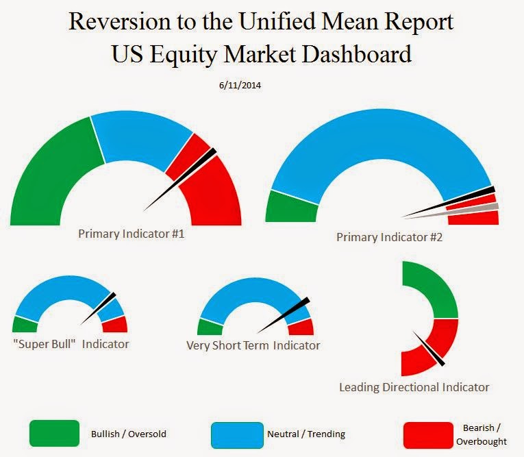
Market Dashboard - Retreating Market


Primary Indicator #1 pulled back today and so did Primary Indicator #2.  This is an indication that the market could be starting a significant retreat.  If Primary Indicator #1 moves back into the blue, it would signal a significant short-medium term (or longer) market decline.  

I had some tight stops set today and they were triggered.  Above is a depiction of my last entry point prediction (most recent green arrow) and where I was eventually stopped out (red arrow.)